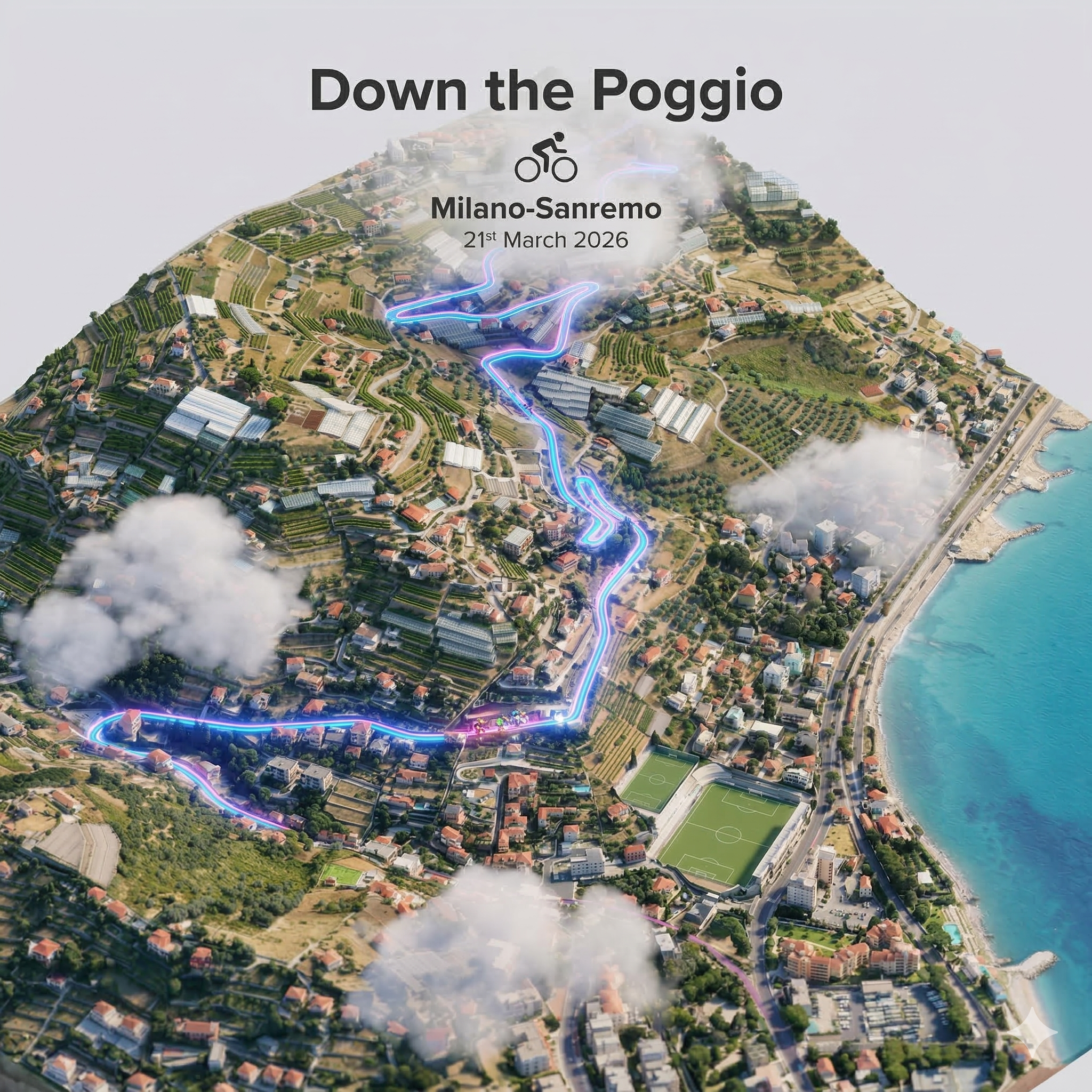
The descent from the Poggio
The Poggio di San Remo is the defining climb of Milano-Sanremo, the longest one-day Classic on the professional cycling calendar. At roughly 298 km, La Classicissima is a race of patience that explodes in the final kilometres. The Poggio rises just 162 m over 3.7 km at an average gradient of 3.7%, but its position, with less than 6 km to the finish, makes the descent that follows one of the most consequential in all of cycling.
The descent from the Poggio is roughly 3.5 km of high-speed road threading through the outskirts of Sanremo. Here, the proximity of the finish line means that every second lost is unrecoverable. Riders must negotiate several key corners at speeds exceeding 80 km/h, often in a compact group after 290 km of racing. The combination of fatigue, tight corners, narrow roads, and racing urgency makes this one of the most studied sections in professional cycling.
The Poggio descent is where races are won and lost. It is not the steepest nor the longest, but it is the fastest and the most consequential.
An optimal descent — in three dimensions
What would the Poggio descent look like if ridden at the physical limit of traction, from start to finish? The interactive simulation below answers exactly that question. A biomechanical rider model is solved with optimal control through the full route geometry, producing a physically consistent trajectory, speed profile, and power demand at every point of the 3.5 km descent.
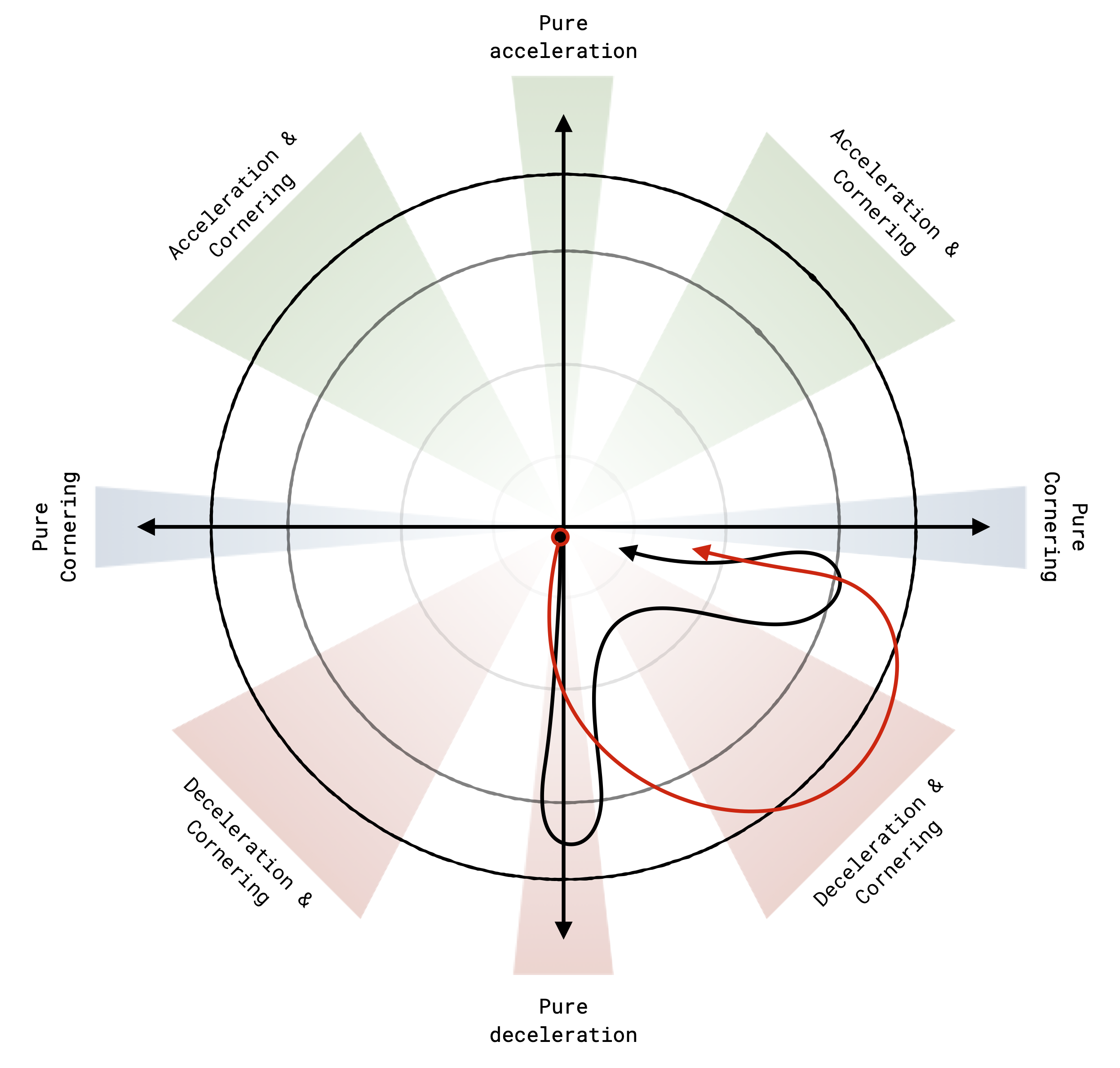
The red trail behind the bike marks where it has already been, fading out as it recedes in time, while the black line ahead shows the next section of predicted path. On the top left, the g-g diagram tracks the instantaneous combination of lateral and longitudinal acceleration normalised by gravity. On the top right, a minimap gives a bird's-eye overview of position along the full descent. Use the Route cursor slider to scrub; toggle Speed or Power to colour the trajectory bars. Drag to orbit, scroll to zoom.
Drag to rotate · Scroll to zoom · Right-click to pan|1:1:1 scale
Why can physics predict where riders go?
One of the most striking results in this line of research is how well a physically constrained model can anticipate the line a rider will actually follow — without any prior knowledge of that rider's individual style or strategy. The reason lies in something fundamental about how humans move.
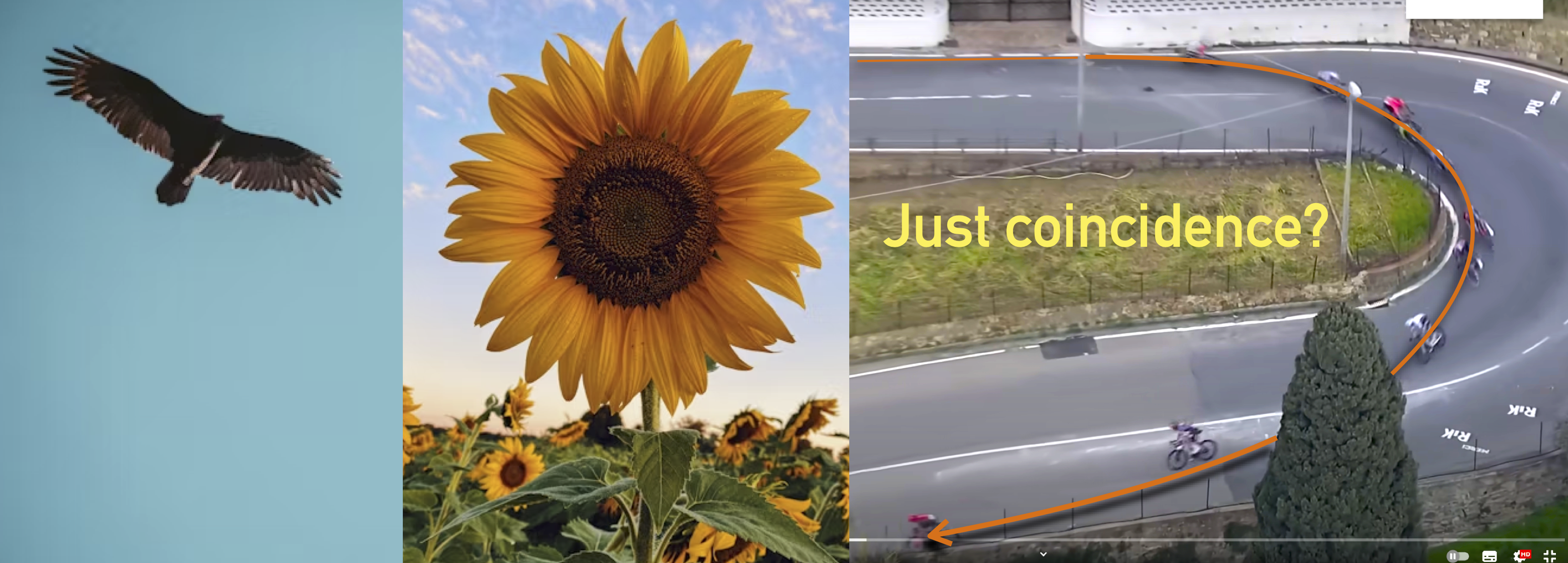
Nature — and human movement within it, tends toward smooth, continuous transitions. Experienced riders trace clothoid-like arcs through corners: curves where curvature increases gradually with distance, minimising lateral jerk and keeping the bike near the limit of traction without abrupt changes in force. This is not a conscious geometric choice; it emerges from the same optimisation that governs an eagle's pursuit trajectory or the spiral of a sunflower. As explored in Eagles, sunflowers and cycling trajectories, the evidence points more strongly toward jerk minimisation than toward pure time minimisation as the underlying objective — smooth transitions are intrinsically preferred by the neuromuscular system.
The consequence is that a physical model — given only the road geometry and traction constraints — converges on the same trajectory that riders empirically tend to follow. Theory and practice agree, not by coincidence, but because both are solutions to the same underlying problem.
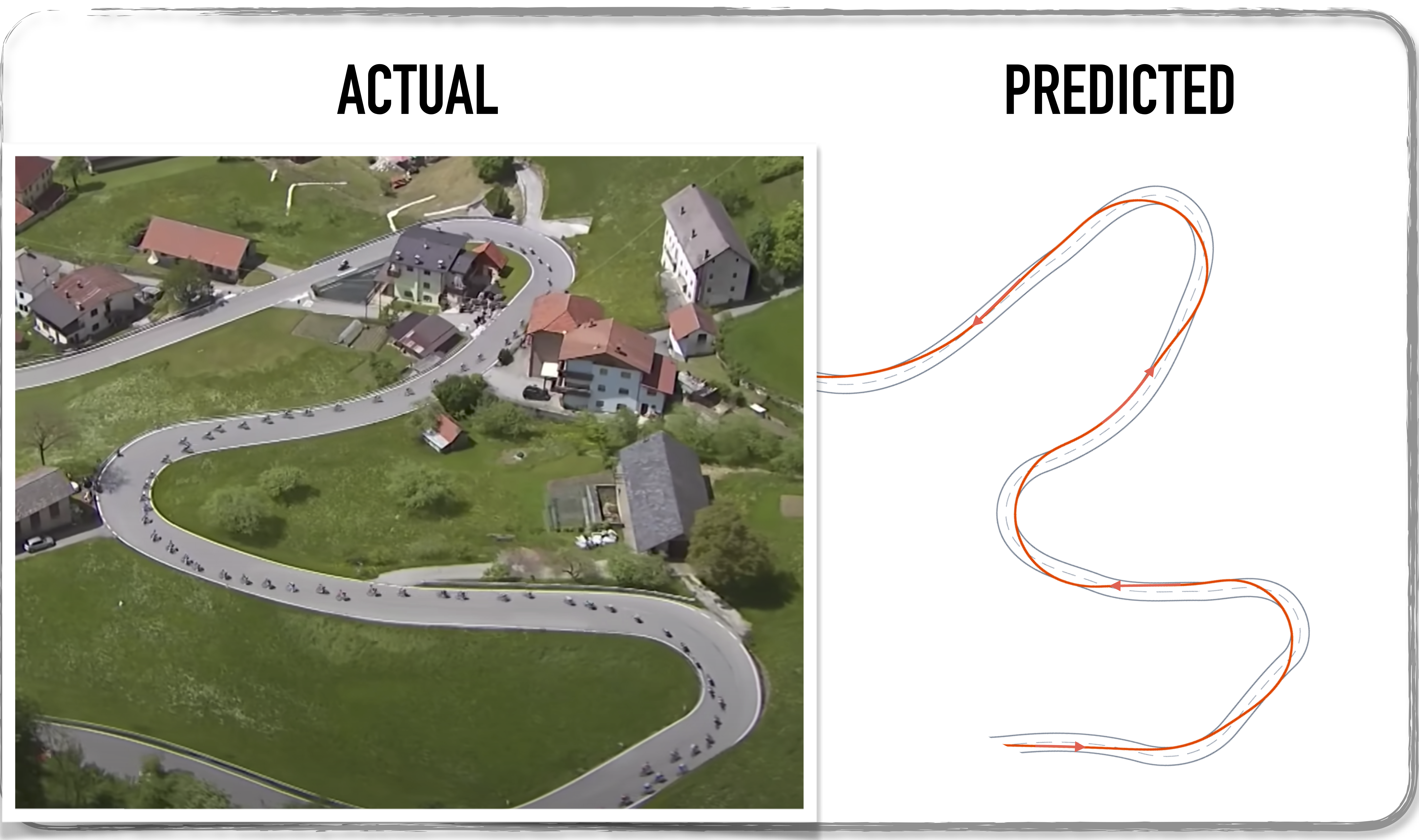
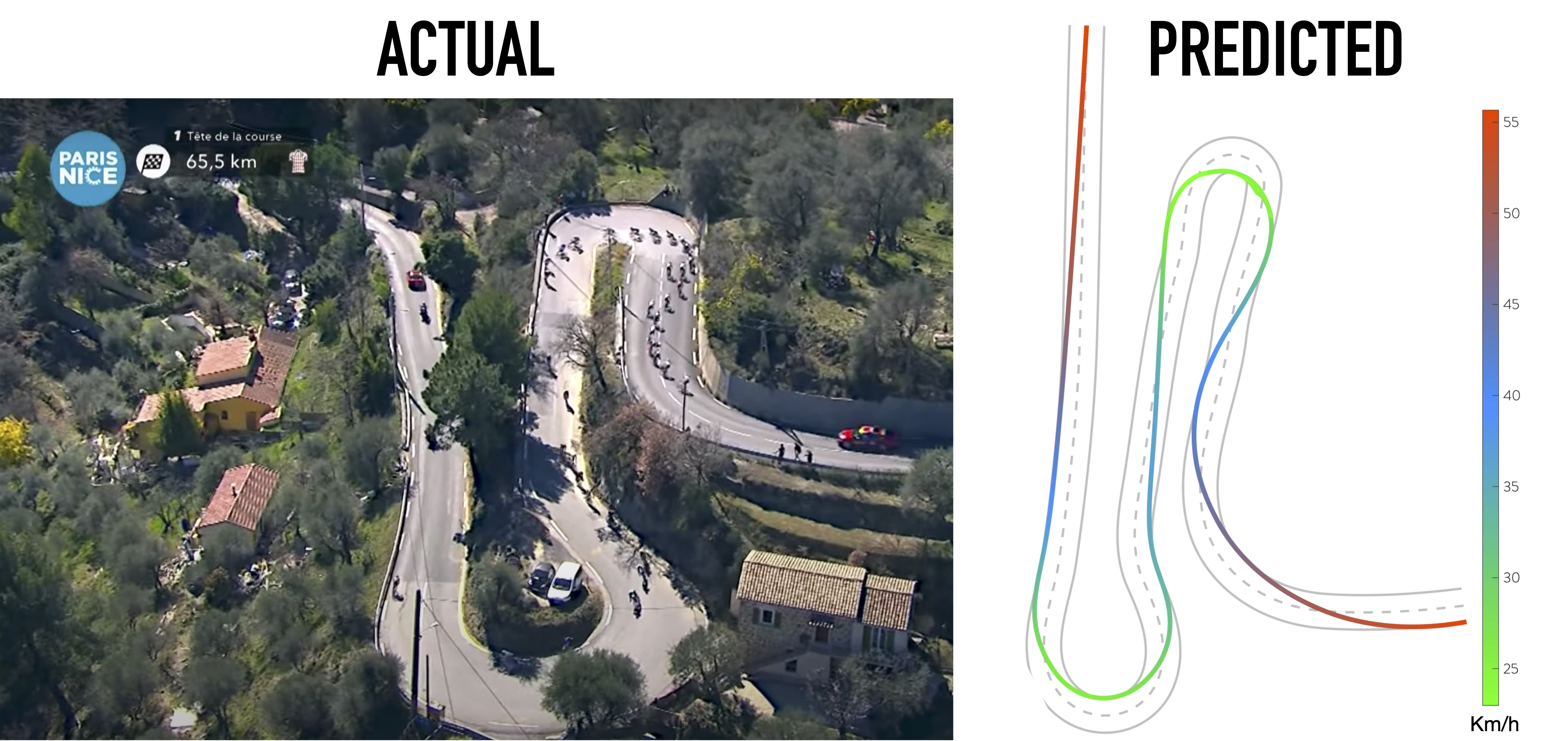
Predicted vs observed: two examples
The comparisons below come from different races. Both show the same phenomenon: the physically predicted reference and the observed GPS trajectory coincide to a degree that would be impossible if riders were making unconstrained, arbitrary choices. Road geometry and traction physics do most of the work.
Reading a descent through physics: the g-g diagram
To understand what separates a great descent from an average one, it helps to have a framework. In vehicle dynamics, originally developed for motorsport, the g-g diagram (also called the friction circle or adherence ellipse) is the standard tool.
The idea is simple: a tyre can only generate a finite total force at the road contact patch. Braking demands longitudinal force; cornering demands lateral force. When you need both simultaneously, braking into a corner, the two forces compete for the same limited tyre capacity. Plot the longitudinal acceleration on one axis and the lateral acceleration on the other, normalised by gravity (in g), and every instant of riding maps to a point in this diagram. The boundary of the cloud of points traces the rider's adherence ellipse: how close they are to the physical limit of the tyre at every moment.
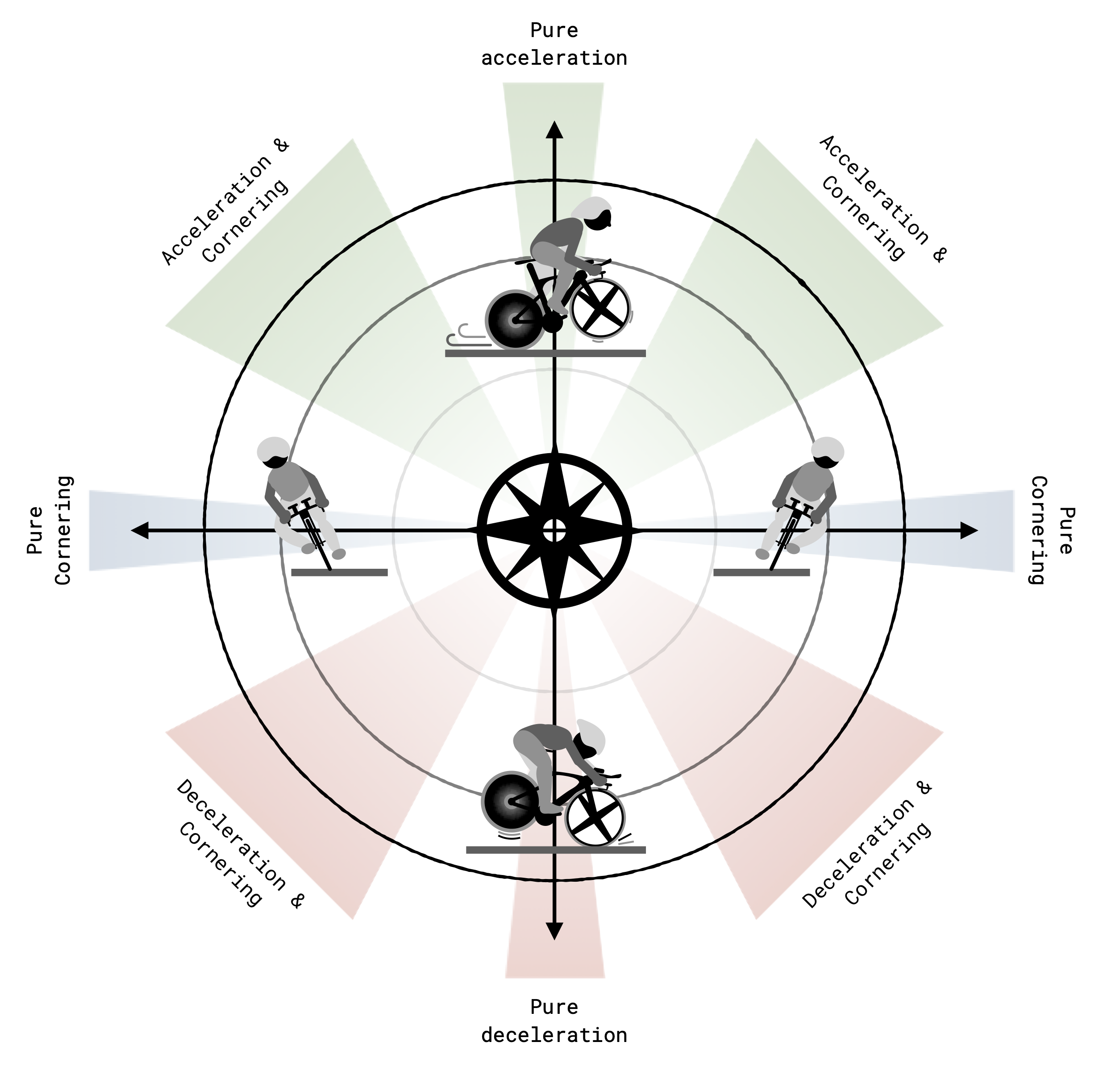
Using a wind-rose analogy: East and West represent high lateral accelerations, typical of fast cornering. North is strong positive longitudinal acceleration: a sprint or a sudden drop in gradient. South is hard braking. A rider who explores all four directions simultaneously is one who blends braking and cornering fluidly, keeping the resultant force near the outer boundary of the ellipse throughout.
Two strategies, two signatures
In practice, two distinct patterns emerge when comparing riders of different skill levels through the same corner. Less experienced riders show a characteristic cross (✝) shape: brake hard first (high longitudinal deceleration, low lateral), then turn (high lateral, low longitudinal): two sequential phases with a dead zone in between. Expert riders show a butterfly (🦋) wing shape: they blend braking and cornering simultaneously, keeping the resultant acceleration vector near the boundary of the ellipse throughout. The butterfly rider is exploiting the friction budget more efficiently: the same tyre, used better.
Research on professional cyclists at an individual time trial with technical content showed that a 10% larger cloud in the g-g diagram was associated with 20 positions gained in the final ranking — a large effect for a difference invisible to the naked eye on TV. A 10% improvement in bike handling ability was estimated to translate to roughly 13 seconds gained over a 5 km technical section.
In the live g-g diagram in the simulation above, you can watch this unfold in real time: notice how the active point swings from the braking region into the lateral region as the bike enters each corner, and how deep into the ellipse the optimal solution pushes at the apex. That is the adherence budget being spent — nothing held in reserve.
Bonus: iconic descents to watch
If you want to see what the physics of the Poggio descent looks like from the saddle, the two videos below are essential viewing. They are not our content — but they are the best way to get a feel for the speeds, the road width, and what it means to ride at the limit on this particular descent.
Nibali 2018 — the definitive attack
Vincenzo Nibali's solo attack on the Poggio descent in 2018 remains the most iconic moment in recent editions of the race. Approaching 90 km/h on a wet road, he opened a gap so large that no one could respond. Watch how he occupies the full width of the road, uses the late apex on the key right-handers, and never once touches the brakes where others would. This is what the butterfly pattern looks like from the outside.
Mohoric 2022 — the dropper post gambit
Matej Mohoric's 2022 victory introduced a detail that caused considerable debate: he descended the Poggio with his seat lowered using a dropper post — a mechanism borrowed from mountain biking that allows the rider to drop the saddle height on the fly. By lowering the saddle, Mohoric reduced his centre of mass height and shifted his body position rearward, increasing rear wheel traction and improving balance through the corners.
From a vehicle dynamics perspective, this is a deliberate intervention on the rider–bike coupling: a lower centre of mass reduces the overturning moment during cornering and improves the bike's resistance to tipping at the traction limit, effectively pushing the outer boundary of the adherence ellipse further outward. The trade-off is a different pedalling geometry and a compromised ability to sprint out of corners: a calculated risk on a descent that leads directly to a flat finish.
Closing thoughts
The Poggio descent compresses everything that makes cycling descending fascinating into 3.5 km of riding. It is short enough that every corner matters, fast enough that physics dominates over strategy, and consequential enough that careers are defined on it.
What optimal control simulation reveals, and what the real trajectory comparisons confirm, is that the room for truly individual choice is narrower than it appears. The road geometry, traction constraints, and the neuromuscular preference for smooth, jerk-minimising motion conspire to funnel riders toward the same line. What separates Nibali from the peloton, or Mohoric from the chasers, is not a radically different trajectory: it is the willingness and ability to ride closer to the outer boundary of the adherence ellipse, for longer, and with greater consistency.
The simulation above makes that boundary visible. The g-g diagram in the top-left corner shows you, at every instant, how much of the available friction is being spent, and how little is being left in reserve.
Further reading
Related posts on this blog
- Notes on bike handling in road cycling: an introduction to the g-g diagram, racing lines, and what bike handling really means from a vehicle dynamics perspective.
- Eagles, sunflowers and cycling trajectories — on clothoids, jerk minimisation, and why nature and optimal riders tend to trace the same smooth curves.
Scientific references
- Zignoli A, Biral F. Prediction of pacing and cornering strategies during cycling individual time trials with optimal control. Sports Engineering. 2020 Dec;23(1):13.
- Zignoli A. Influence of corners and road conditions on cycling individual time trial performance and ‘optimal’ pacing strategy: a simulation study. Proceedings of the Institution of Mechanical Engineers, Part P: Journal of Sports Engineering and Technology. 2021 Sep;235(3):227–36.
- Zignoli A, Biral F, Fornasiero A, Sanders D, Erp TV, Mateo-March M, Fontana FY, Artuso P, Menaspà P, Quod M, Giorgi A. Assessment of bike handling during cycling individual time trials with a novel analytical technique adapted from motorcycle racing. European Journal of Sport Science. 2022 Sep 2;22(9):1355–63.
- Zignoli A. An intelligent curve warning system for road cycling races. Sports Engineering. 2021 Dec;24(1):19.
- Zignoli A, Fruet D. Insights in road cycling downhill performance using aerial drone footages and an ‘optimal’ reference trajectory. Sports Engineering. 2022 Dec;25(1):23.
- Zignoli A. Assessing Trajectories and Bike Handling Abilities in Road Cycling with Global Positioning System Data. Sensors. 2025 Nov 14;25(22):6977.